
Burke Museum
Making the invisible visible at the museum
Role
Product Designer
Timeline
10 Weeks
Client
Burke Museum

90%
Of tasks completed by visitors, on site and unassisted
0
New hardware for the museum to install or maintain
2
Tools designed: a visitor site and a staff dashboard
What is the Burke?
The Burke Museum is Washington’s natural history and culture museum. Its working labs sit behind glass, so visitors can watch scientists at work.
The problem
A glimpse through a lab window isn’t context
Visitors couldn’t understand what they were seeing, and lab technicians had no easy way to explain it.
Over 10 weeks, I conducted desk research, field observations, interviews with visitors and lab techs, and an audit of existing museum technology. Both sides wanted the same thing: a simple way to connect expert knowledge with visitor curiosity.
I created two concepts: a staff dashboard for posting quick updates about ongoing work, and a visitor web experience for asking questions and gaining context. The result was a transparency model that fit how the museum actually operates, not an idealized version of it.

Research
Being in the space let us catch confusion as it happened
I started with desk research and a competitive analysis of museum apps, which pointed to one gap: visitors want more context than museums give them.
To see it firsthand, my team and I observed the Burke at different times and days, then interviewed visitors mid-visit and lab technicians at their workstations. Being in the space mattered. Visitors flagged confusion as it happened, and technicians showed us workarounds they’d built to reach people at the windows.
1.
Desk research
A competitive analysis of museum apps.
2.
Field observations
At the Burke, on different days and times.
3.
Interviews
Visitors mid-visit, and technicians at their workstations.
4.
Tech audit
A review of the museum’s existing technology.


field notes and photos, coded into an affinity diagram
Insights
Visitors weren’t disengaged. They were under-informed.
People lingered at lab windows and searched their phones for context mid-visit.
Process, not just facts
Placards said what something was, not why it mattered. That gap made the whole exhibit feel uncertain.
Techs were already bridging the gap
One had filled whiteboards with context for visitors. The motivation was there; the tools weren’t.
Complex tech wasn’t the answer
The Burke had tried cameras and TVs before and couldn’t sustain them. Staff actively avoided anything fragile or high-maintenance.
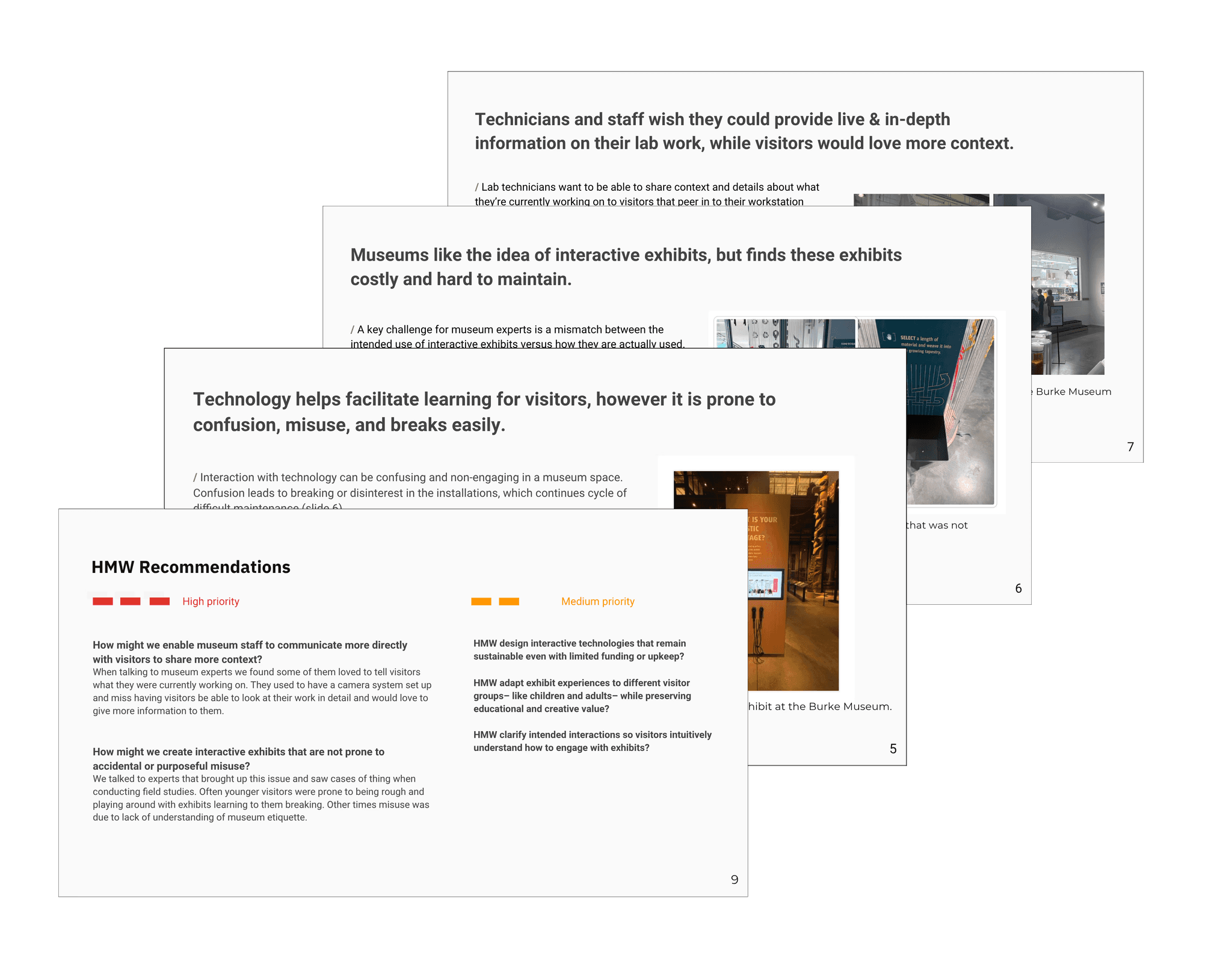
the findings deck: our top findings and recommendations
What that pointed to
A lightweight, low-maintenance way for technicians to share real-time context.
The decision
One question decided it: would technicians actually use it?
Techs told us technology in museums breaks, costs money, and rarely lasts. That ruled out any new hardware.
Question 1
Would visitors actually understand it?
Question 2
Would it hold up over time?
Question 3
Would technicians use it without disruption?

early sketches: whiteboard doodles and post-its
We converged on a two-part system
• A website where visitors scan QR codes to ask questions and learn more
• A dashboard where lab techs share updates and livestream without expensive TV tech, and answer visitor questions directly

What I designed
Two simple tools and zero new hardware

1.
Lab Tech Dashboard
Technicians post a quick update in a few moments, without interrupting their work.
I vibe-coded the concepts in FigmaMake, then refined them in Figma for interaction and fidelity.
2.
Visitor website
Visitors scan a QR code to see live updates and plain explanations, and to ask questions that technicians answer when they have time.
Visitors submit questions that technicians answer asynchronously, creating an ongoing loop without requiring real-time interaction.

Live videos and updates from lab staff
Clear explanations of ongoing processes
Q&A system for visitors and staff to engage
This system:
Removed reliance on fragile technology
Made lab work more accessible
Balanced visitor curiosity with staff constraints
Validation
Visitors completed 90% of tasks, on site and unassisted
I ran on-site cognitive walkthroughs with 5 participants, who were asked to learn about a specific lab, learn what it is currently working on, and submit a question. Users successfully accessed and understood lab content, with clear improvements in confidence and comprehension.
5
participants in on-site cognitive walkthroughs
4
tasks: find a lab, see its current work, ask a question, look for a different lab
90%
average task completion

pass/fail by task: of 5 tasks, only 2 were ever failed, across 4 participants

the full research deck: usability issues, by priority
Still to test
The staff dashboard hasn’t been usability tested with lab technicians yet. That’s the next step.
Due to time constraints around the holidays, we weren’t able to test it with them directly. Validation there relied on interviews and observation rather than in-context testing, an important remaining gap.
Results
A simple, reliable way to talk across the lab window
The redesigned system gave visitors and technicians a simple, reliable way to communicate across the lab window. Usability testing showed a 90% task completion rate: visitors could find what a lab was working on, understand the process, and submit a question unassisted, with no hardware to break or maintain.
Reflection
Two audiences pulling apart pushed me toward simplicity
Visitors want access; technicians need focus. Designing for both at once is what made the simplest option the right one.
The biggest remaining gap is real-world testing with lab technicians on the staff dashboard. That’s the obvious next step.