
curaJOY
From a static prompt to reflecting together
Role
Lead Product Designer
Timeline
6 Weeks
Client
CuraJOY

+4.7%
Overall user satisfaction, from user surveys
9 sessions
Remote think-aloud walkthroughs in the first round
A teacher
How can the teacher prevent emotional outbursts from students during her daily lessons?
A teenager
How can the teenager find out what is triggering her eating disorder?
A parent
How can the parent connect with her child who struggles with self-regulation?
What is curaJOY?
curaJOY is a wellness platform focused on making mental health support more accessible through behavioral therapy, healthcare practices, and AI-driven insights. What makes it unique is its focus on supporting not just individuals, but entire family systems.

The starting point
Journaling was in the product, but just barely
When I joined as a Product Design Lead, journaling was already part of the product, but just barely. It was a single static prompt, a cover image, and a basic text box. It worked, but it didn’t feel like anything.
There was no emotional depth, no real reason to come back, and it didn’t reflect curaJOY’s mission of long-term connection and well-being. So I took a step back and asked a bigger question.

How might we…
support deep personal reflection while bringing meaningful social connection into journaling?
Framing the problem
I turned an ambiguous ask into three researchable questions
The challenge was initially ambiguous. curaJOY was looking to add more activities to their app to create more modes of engagement and give more ways to add reflection and connection. I reframed this into key researchable questions.
Motivation
What motivates users to return to journaling over time?
Meaning
What makes reflection feel meaningful rather than performative?
Privacy
How do users navigate the tension between privacy and connection?
This framing helped guide both method selection and design direction.
Discovery
Users wanted depth and connection, but feared exposure
To understand both user behavior and underlying motivations, I led my team in using a mixed-methods approach.
one
Heuristic audit (Nielsen’s 10 heuristics)
To quickly identify usability gaps and structural issues. My team of designers and I ran it not only to see where the current designs needed to improve, but also to understand the problem space more deeply.
two
Remote think-aloud cognitive walkthroughs
To observe real-time behaviors, confusion, and emotional reactions. We ran 9 sessions in the first round, pulling from a broad range of ages to get the full scope of potential users. All participants had to be fluent in English.
This combination allowed me to move beyond surface-level usability issues and uncover deeper barriers.

Problem areas in the current design of the journal activity. Doing a heuristic audit with my team early on helped us really understand the product on a deeper level as we were onboarding.

the affinity diagram from round one
Affinity diagram from the first round of usability testing, showing confusion about the sharing of journal entries and the inability to find sharing controls.
Reflection vs. surface-level interaction
Users wanted depth, but the experience didn’t support it.
“I’m not so sure what I understand from this…”
“I’d rather do a bullet list of what happened… not really journaling.”
Desire for connection vs. fear of exposure
Users were open to sharing, but anxious about who could see their entries.
“I wouldn’t like it. I want my journal to be private.”
“People can give you advice… if you’re willing to open up.”
Motivation vs. lack of structure
Users struggled to return consistently without guidance or accountability.
“I’m not sure if I’m able to align myself with this kind of activity.”
“I’m not really into journaling.”
From these patterns, I translated insights into three core design principles: Introspection, Connection, and Safety.
Principles
Three needs shaped the redesign: introspection, connection, safety
Introspection
Journaling should feel like a space to actually think and process. We redesigned the experience to be calmer and more intentional, helping users go deeper instead of just writing surface-level responses.
Connection
Journaling is usually a solo activity, but it doesn’t have to be isolating. We introduced shared prompts so people could reflect alongside others. This added a sense of accountability and made the experience feel more meaningful.
Safety
None of this works if people don’t feel safe. We made privacy controls really clear and upfront, so users always know who can see what. That clarity helps build trust and makes it easier to be honest.
What I designed
A journal that asks back, shares fairly, and stays private
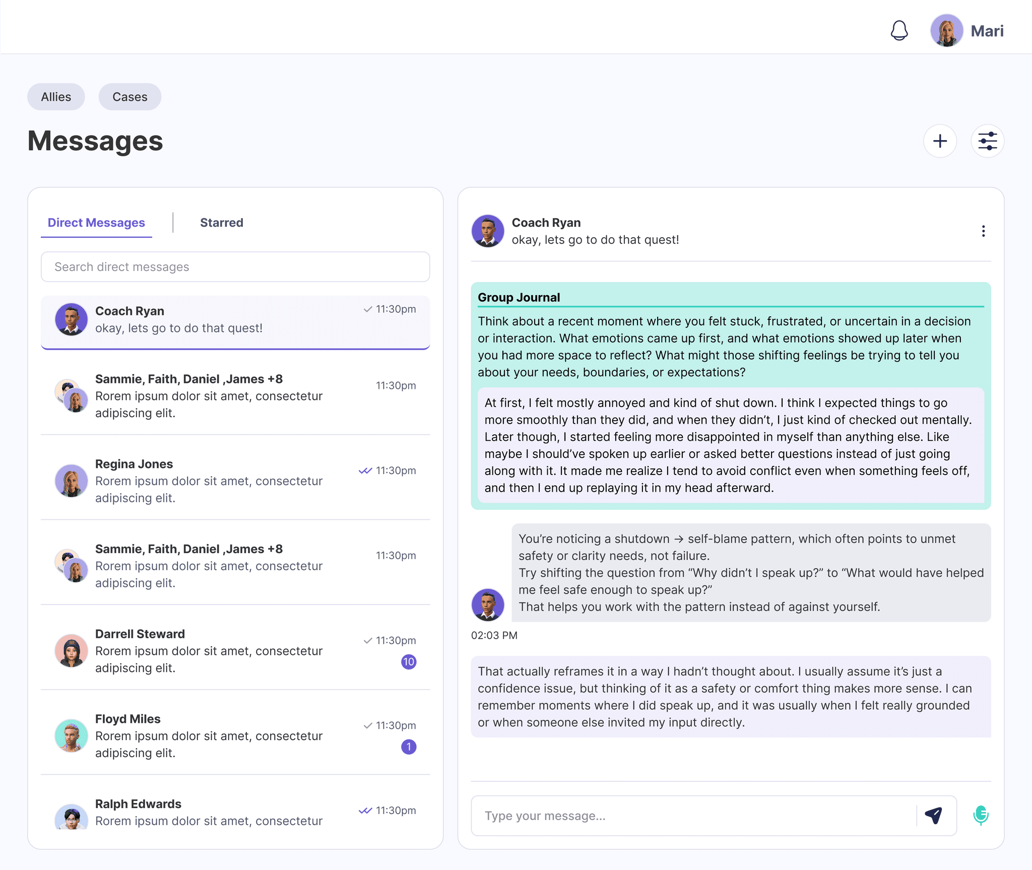
AI-Guided Reflection
Instead of one static prompt, the AI coach asks follow-up questions that help people go deeper and keep going.
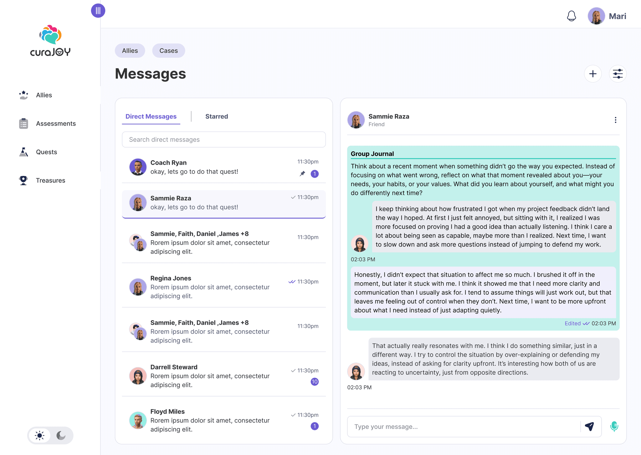
Shared Journaling
Friends answer the same prompts, but the responses stay hidden until everyone submits. Adding social incentive.

Explicit Privacy Controls
Before writing, users choose exactly who can see their entry. No guessing who can see what anymore.
What were the trade offs of using AI for this feature?
Great Question! Allowing the AI coach to be a part of the journal deepens reflection through follow-up questions.
I see the value in that.
However, the main purpose was to give a place of reflection for those that would like to not share their reflections with others and still get reflection. AI is used in a way to strengthen privacy not replace the social connection with others completely
Validation
We checked that it felt better, not just looked better
We wanted to make sure this actually felt better, not just looked better. So I ran another round of think-aloud walkthroughs. Results showed clear improvements in three areas.
Results
Journaling left the backlog and satisfaction rose 4.7%
Journaling had previously been sitting in the backlog, but once we showed how it could support curaJOY’s core mission, it quickly became a priority.
User satisfaction
Contributed to a 4.7% increase in overall user satisfaction, based on user surveys.
Trust
Improved trust via clear, user-controlled privacy boundaries.
Sense of community
Strengthened sense of community through shared prompts.
Reflection
Trust behavior over stated preference
This project changed how I think about journaling. I used to see it as purely private, but research showed me it can also be social and supportive when designed with the right boundaries. That tension between privacy and connection became the core design problem.
It also changed how I design. Participants said they wanted social features, but their hesitation during testing showed discomfort with visibility and comparison. I learned to trust behavior over stated preference.
As a first-time lead, I pushed for introspective experiences while working within a tight scope. We didn’t go as deep on every concept as I wanted, and comparison shipped despite mixed signals. Knowing when to push and when to align was the real lesson.
Designing for reflection taught me that research isn’t just validation. It’s how I learn people’s boundaries.